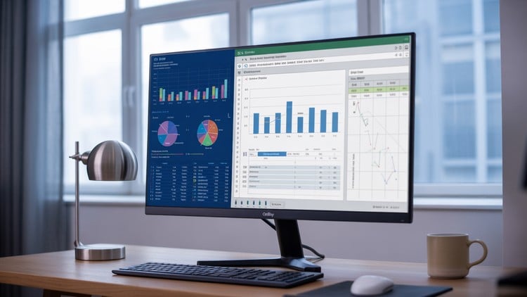
Master Excel and Power BI to create stunning project management dashboards, reports
What you will learn
Master Excel and Power BI fundamentals for professional project reporting and dashboard creation
Import, clean, and structure project data from multiple sources using advanced Excel tools and Power Query
Create complex formulas using VLOOKUP, INDEX-MATCH, and conditional functions for data analysis
Build interactive pivot tables and pivot charts to summarize and visualize project performance metrics
Design advanced visualizations including waterfall charts, combo charts, and interactive heatmaps
Develop time-based analysis skills using advanced date functions and trend visualization techniques
Complete two hands-on projects: Excel project dashboard and advanced Power BI interactive report
Apply data modeling principles and calculated fields to create professional business intelligence reports
The “Stop Making Ugly Charts” Manifesto: An Honest Review
Let’s be real for a second: most project reports are where data goes to die. I’ve spent over a decade in the tech trenches, and if I had a dollar for every time I saw a project manager present a blurry screenshot of a messy spreadsheet, I’d be retired by now. The Project Management Graphical Reporting course is essentially a wake-up call for anyone who thinks a basic bar chart is enough to keep stakeholders happy. This isn’t just about making things look “pretty”; it’s about data storytelling and building job-ready skills that actually influence decision-making at the C-suite level.
What I appreciated most here is the departure from theoretical fluff. Instead of talking about the *idea* of a report, you’re forced to get your hands dirty with industry-standard tools. The course bridges the massive gap between “I know how to use a computer” and “I can automate a professional business intelligence report.” If you’re tired of spending your Sunday nights manually updating dates and status colors, the hands-on labs in this curriculum are going to be your new best friend. It’s about moving from a reactive “spreadsheet jockey” to a proactive analyst who provides actual insights.
What You Need Before Diving In
You don’t need a computer science degree, but don’t walk in here completely cold either. You should have a basic comfort level with Excel—I’m talking about knowing your way around a ribbon and basic math functions. If you don’t know what a “cell” is, you’re going to have a bad time. However, the course is designed to take you from a beginner to advanced level relatively quickly. The real prerequisite is a mindset shift: you have to be willing to stop “hard-coding” everything and start thinking about data modeling principles. Be ready to fail a few times when writing your first complex INDEX-MATCH; it’s all part of the process.
The Toolkit: Skills That Actually Matter
The curriculum is heavy on the “Big Two”: Excel and Power BI. But it’s the way they integrate them that counts. You’ll spend a significant amount of time in Power Query, which, in my opinion, is the most underrated tool in the modern office. Learning to import, clean, and structure project data automatically is a life-changer.
- Advanced Formulas: Moving beyond VLOOKUP into the world of INDEX-MATCH and conditional functions.
- Dynamic Visualizations: Creating waterfall charts and interactive heatmaps that actually respond to user input.
- Power BI Integration: Learning how to take those Excel skills and pivot into a full-scale interactive report.
- Time-Based Analysis: Mastering trend visualization so you can tell if a project is actually on track or just pretending to be.
Career Growth and Real-World Job Roles
In today’s market, “Project Manager” is a generic title. “Data-Driven Project Lead” is a career. Completing these real-world projects gives you a portfolio you can actually show off during an interview. This course serves as excellent certification prep for those looking to validate their technical prowess in PMO (Project Management Office) roles.
Common job roles that benefit from these job-ready skills include:
- Project Coordinators: Who need to automate status updates.
- Operations Managers: Who require professional reporting to track KPIs across departments.
- Business Analysts: Who need to translate raw data into interactive pivot tables for executive review.
- Portfolio Managers: Who handle multiple data sources and need a unified Power BI dashboard.
The Pros: Why This Works
- Zero Fluff, High Utility: The course focuses on hands-on labs. You aren’t just watching videos; you’re building an Excel project dashboard from scratch. By the time you’re done, you have a functional tool you can literally use at your job the next day.
- The Power Query Deep Dive: Most courses skip the “boring” data cleaning part. This one embraces it. Understanding how to structure data is what separates the pros from the amateurs.
- Bimodal Tooling: Learning both Excel and Power BI is smart. Excel is the universal language of business, but Power BI is the future of career growth in analytics. Having both on your resume is a massive win.
The Con: An Honest Reality Check
The learning curve for calculated fields and data modeling can feel like hitting a brick wall if you’ve never thought about data relationships before. It’s not “easy.” You will likely get frustrated with some of the more complex formulas or when your Power BI relationships return “Many-to-Many” errors. The course moves fast, and if you aren’t paying attention to the logic behind the clicks, you’ll find yourself just mimicking the instructor rather than actually learning the “why.” You’ve got to put in the extra reps to make these skills stick.